| Author |
Message |
|
Geoff Wood
|
 Posted: Mon 27 Nov, 2006 3:11 am Post subject: Posted: Mon 27 Nov, 2006 3:11 am Post subject: |
 |
|
| Jean Thibodeau wrote: |
Last minute possible change would be to use the wolf's head instead of the initials on the pommel and maybe a fleur-de-lis on the other side? This way the initial on the guard could almost be a " DaVinci Code " sort of thing ?
( I give Nathan credit for making me think of this option.   Decisions pending discussions with Matthew at OlliN. ) Decisions pending discussions with Matthew at OlliN. ) |
So, is the wolf head meant to symbolise the 'bold' part of your surname and the fleur the 'people/race' bit?
Edit: Have you considered giving the j and t a common top bar and making the combined initial into a sort of pi sign (maybe keep people guessing a bit longer and a pseudo classical joke)?
|
|
  |
 |
Jean Thibodeau

|
| Posted: Mon 27 Nov, 2006 3:32 am Post subject: |
|
|
| Geoff Wood wrote: | | Jean Thibodeau wrote: |
Last minute possible change would be to use the wolf's head instead of the initials on the pommel and maybe a fleur-de-lis on the other side? This way the initial on the guard could almost be a " DaVinci Code " sort of thing ?
( I give Nathan credit for making me think of this option. Decisions pending discussions with Matthew at OlliN. ) |
So, is the wolf head meant to symbolise the 'bold' part of your surname and the fleur the 'people/race' bit?
Edit: Have you considered giving the j and t a common top bar and making the combined initial into a sort of pi sign (maybe keep people guessing a bit longer and a pseudo classical joke)? |
I just like the wolf as a symbol and if I was inventing a heraldic coat of arms I would use the wolf as an important element.
The Fleur-de-lis sort of makes sense since I'm French Canadian of Norman / Breton ancestry and the Québec provincial flag uses the fleur-de-lis.
The JT did have a common bar in some early versions and it still does in a way if one discounts the curved V shaped bite out of it in the middle: So it is sort of an interrupted bar.
I can also see the pi sign in there and in some forms it can also look a bit like a Chinese or Japanese character.
( I'm sort of hoping it doesn't say something " rude " in another language.  ) When I initial a document I do make a J and a T using the bar crossing both. ( Sort of the basis of the design ! I did also try to make it slightly Gothic in feel as well. ) ) When I initial a document I do make a J and a T using the bar crossing both. ( Sort of the basis of the design ! I did also try to make it slightly Gothic in feel as well. )
You can easily give up your freedom. You have to fight hard to get it back!
|
|
|
|
|
Vincent Le Chevalier

|
| Posted: Mon 27 Nov, 2006 4:46 am Post subject: |
|
|
| Jean Thibodeau wrote: |
I can also see the pi sign in there and in some forms it can also look a bit like a Chinese or Japanese character.
|
Playing with my very limited (and kind of specialized ) knowledge of ideograms, it could look like the one for sword, knife, saber... Perhaps even more so if you put the T before the J.
Of course a Chinese ideogram is not exactly what one would expect to find on this kind of sword, but if you're aiming for multiple meanings, you could go with that 
--
Vincent
Ensis Sub Caelo
|
|
 |
|
|
Russ Ellis
Industry Professional
|
| Posted: Mon 27 Nov, 2006 6:24 am Post subject: |
|
|
Very nice looking so far Jean, I'll be very interested to see what form the final item takes. I've got a picture I need to send you as well tonight, something you might be interested in...
TRITONWORKS Custom Scabbards
|
|
|
|
|
Nate C.

|
| Posted: Mon 27 Nov, 2006 1:56 pm Post subject: |
|
|
Jean,
Regarding the JT as Pi symbol. JT Pälikkö actually uses this as his maker's mark. It might be good to avoid anything too similar to his version out of courtesy. I actually rather like the stylized version. I might also try something similar but with a celtic/knotwork style too just to see what it would look like. Not necessarily the right period for this sword but it would look cool.
Cheers,
Nate C.
Sapere Aude
"If you are going to kill the man, at least give him a decent salute." - A. Blansitt
If they ever come up with a Swashbuckling School, I think one of the courses should be Laughing, then Jumping Off Something. --Jack Handy
|
|
|
|
|
Jean Thibodeau
|
| Posted: Mon 27 Nov, 2006 2:52 pm Post subject: |
|
|
| Vincent Le Chevalier wrote: | | Jean Thibodeau wrote: |
I can also see the pi sign in there and in some forms it can also look a bit like a Chinese or Japanese character.
|
Playing with my very limited (and kind of specialized ) knowledge of ideograms, it could look like the one for sword, knife, saber... Perhaps even more so if you put the T before the J.
Of course a Chinese ideogram is not exactly what one would expect to find on this kind of sword, but if you're aiming for multiple meanings, you could go with that |
At the least I do want to avoid it meaning something I'm not aware of that might be negative, but it is a personal symbol of my design and I'm not overly obsessing about giving it numerous multiple meanings.
( I appreciate all suggestions and any new knowledge is useful for it's own sake. )
You can easily give up your freedom. You have to fight hard to get it back!
|
|
|
|
|
Jean Thibodeau
|
| Posted: Mon 27 Nov, 2006 3:01 pm Post subject: |
|
|
| Nate C. wrote: | Jean,
Regarding the JT as Pi symbol. JT Pälikkö actually uses this as his maker's mark. It might be good to avoid anything too similar to his version out of courtesy. I actually rather like the stylized version. I might also try something similar but with a celtic/knotwork style too just to see what it would look like. Not necessarily the right period for this sword but it would look cool.
Cheers, |
I wouldn't want it to be a close " copy/version " of someone else's makers mark ! But these are my initials so I do feel I can use them. ( Nobody has a monopoly on the Alphabet. )
In any case the resemblance to the pi symbol need not be emphasized and is just another of those ambiguous things making the initials more " stealth/hidden " in the pattern.
Hopefully my version/style is sufficiently different to not be confused with a maker's mark.
A certain Celtic look to the repeating initials on the guard is not a bad idea even if it turn out to only be distantly Celtic.
You can easily give up your freedom. You have to fight hard to get it back!
|
|
|
|
|
Jean Thibodeau
|
| Posted: Mon 27 Nov, 2006 3:32 pm Post subject: |
|
|
| Nate C. wrote: | Jean,
Regarding the JT as Pi symbol. JT Pälikkö Cheers, |
Had a look at his site and the JT is reasonably different from my version so I don't think it should cause confusion.
By the way, I went to the maker's site and I'm impressed by many interesting pieces there.
( I think I will start a Topic thread about his site as the work deserves the exposure. )
You can easily give up your freedom. You have to fight hard to get it back!
|
|
|
|
|
|
J. Bedell
|
| Posted: Mon 27 Nov, 2006 4:15 pm Post subject: |
|
|
Jean,
I like your original font design for the initials, I would stick with that if I were you, i think it's pretty awesome looking. This ought to be a nice sword, I can't wait to see it when it is completed!
-James
The pen may be mighter, but the sword is much more fun.
|
|
  |
|
Jean Thibodeau
|
| Posted: Mon 27 Nov, 2006 5:48 pm Post subject: |
|
|
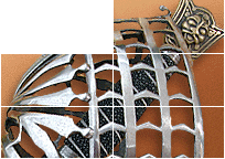
At this point here are the options I'm mulling over for the pommel engraving.
OPTIONS on Pommel:
1) JT on one side the other blank.
2) JT on both sides.
3) JT on one side, fleur-de-lis on the other.
4) JT on one side, wolf's head on the other side.
5) Wolf's head on one side, fleur-de-lis on the other.
I think I'm leaning to either 4) or 5) For the wolf's head I would do another PHOTOSHOP drawing I think and make stylized to match the look of the JT. ( Somewhat abstract wolf using minimal lines. )
A final decision can be deferred until the engraving/inlay process starts.
Note: The large version of the JT on the pommel is finer in details than the repeating one's on the guard and it's one reason to have it there bigger. ( If it takes away from the hidden aspect of the iconography is a factor but I'm not sure that the priority is making the markings mysterious or having a nicer larger version of the JT ? )
Note: The small JT(s) on the guard are deliberately coarser because at the smaller scale the lines would be too fine.
If you look at the drawing of the JT closely you should notice how the smallest version is not just smaller but also a modified version of the full scale JT. ( Maybe too much detail here, but I'm giving you a window into my thinking process when designing this stuff. )
You can easily give up your freedom. You have to fight hard to get it back!
|
|
|
|
|
|
J. Bedell
|
| Posted: Mon 27 Nov, 2006 6:02 pm Post subject: |
|
|
Jean,
I like option 4, just my opinion.
-James
The pen may be mighter, but the sword is much more fun.
|
|
|
|
|
Jean Thibodeau
|
| Posted: Mon 27 Nov, 2006 6:13 pm Post subject: |
|
|
| J. Bedell wrote: | Jean,
I like option 4, just my opinion.
-James |
So do I, option 4) appeals to me best at this point: Thanks for the feedback ( It good to be open to suggestions but at the end one has to go with what one really wants: At times it takes time figuring out what one really wants. )
You can easily give up your freedom. You have to fight hard to get it back!
|
|
|
|
|
Jean Thibodeau
|
| Posted: Wed 06 Dec, 2006 6:01 am Post subject: |
|
|
An update:
Received a full sized line drawing of the sword for approval and it really helps to be able to put some of my swords on the drawing and visualize how big this sword is going to be ! ( BIG ).
The size of grip they got just right I think since it should be just long enough that a two handed grip should be possible by holding on to the pommel with the off hand: Although the intent is for a one hander you may all know about my pet theory about using two hands on short handles, either cupped or pommel hold.
I have send an e-mail to Matthew with some minor changes and below is a small part of it:
" Looking at the fuller and the two hollow ground ( Shallow(er) fullers ) I wonder if it wouldn't actually look and function better if the centre fuller extended past the hollow grinding instead of ending sooner. The main fuller should be extremely defined, but with the shallow fullers the transition from hollow ground to lenticular near the point should be more subtle than in the drawing: Not too subtle but shouldn't suddenly create a sharp transition. "
Here are a couple of drawings showing the possible changes in the length relationship of the fuller to hollow grind and the transition to lenticular grind.
 Attachment: 64.48 KB Attachment: 64.48 KB
[ Download ]
Attachment: 55.02 KB
[ Download ]
You can easily give up your freedom. You have to fight hard to get it back!
|
|
|
|
|
|
J. Bedell
|
| Posted: Wed 06 Dec, 2006 2:03 pm Post subject: |
|
|
Jean,
I think it would look very nice with a deep hollow grind for the two fullers, then they would slowly become shallower until they lead into the lenticular cross section. I agree with the decision to have the main fuller extend past the hollow grind, if nothing else, I think it would look better than having it end sooner, and if it is going to be BIG it might even help cut down on some weight. A very nice looking sword, I can't wait to see it "in the steel". 
-James
The pen may be mighter, but the sword is much more fun.
|
|
|
|
|
Jean Thibodeau
|
| Posted: Wed 06 Dec, 2006 8:37 pm Post subject: |
|
|
| J. Bedell wrote: | Jean,
I think it would look very nice with a deep hollow grind for the two fullers, then they would slowly become shallower until they lead into the lenticular cross section. I agree with the decision to have the main fuller extend past the hollow grind, if nothing else, I think it would look better than having it end sooner, and if it is going to be BIG it might even help cut down on some weight. A very nice looking sword, I can't wait to see it "in the steel".
-James |
Thanks very good suggestion and although I'm sure that Matthew will read your comment I did forward it to him in my last e-mail and said that it sound like a good idea:
E-mail excerpt: " Worth thinking of as the thickness of the blade is greater near the guard so the hollow grinding could be deeper there and taper gradually to a flatter hollow grind, then transition to lenticular very gradually.
Very complex grinding and the " ideas " should always be subject to good structural design i.e. not create a weak point at the transition. "
You can easily give up your freedom. You have to fight hard to get it back!
|
|
|
|
|
|
J. Bedell
|
| Posted: Thu 07 Dec, 2006 3:55 pm Post subject: |
|
|
Jean,
I'm glad I could offer something of value! This is really a fascinating project, I love the design.
Have you decided on a pommel design? Do you have any concepts for the wolf head?
-James
The pen may be mighter, but the sword is much more fun.
|
|
|
|
|
Jean Thibodeau
|
| Posted: Thu 07 Dec, 2006 4:52 pm Post subject: |
|
|
| J. Bedell wrote: | Jean,
I'm glad I could offer something of value! This is really a fascinating project, I love the design.
Have you decided on a pommel design? Do you have any concepts for the wolf head?
-James |
Probably version 4) Wolf's head on one side and initials on the other, probably copper inlaided.
The wolf's head will probably be made of simple lines and I will try to make those lines consistent with the style of the lines on my initials. I'm still at the point were I'm letting my subconscious mind work on it and wait for an idea to " impose " itself.
A little bit of research looking at real wolves ( pics ) and graphic versions of whatever style I can find.
The scabbard will probably also have some of the same design elements and the probability is very high ( 99.9% ) that I will make this a cooperative project by getting Russ Ellis to help me design it and make it.
( Not official yet but I've mentioned this to both Matthew at OlliN and Russ: So at some point Russ might join this Topic as a participant in the project and/or start his own topic at his discretion. )
And thanks again for the useful suggestions.
You can easily give up your freedom. You have to fight hard to get it back!
|
|
|
|
|
Allen Andrews

|
| Posted: Fri 08 Dec, 2006 6:37 am Post subject: |
|
|
|
I think this project looks great. I appreciate the ongoing narrative, it gives insights into how a custom sword project might evolve. Of course I am REALLY looking forward to seeing the finished sword/scabbard
|
|
|
|
|
Jean Thibodeau
|
| Posted: Fri 08 Dec, 2006 7:28 am Post subject: |
|
|
| Allen Andrews wrote: | | I think this project looks great. I appreciate the ongoing narrative, it gives insights into how a custom sword project might evolve. Of course I am REALLY looking forward to seeing the finished sword/scabbard |
It's also more fun for me and the feedback from others has been helpful.
I think that even suggestions I opt to not follow are useful because sometimes one discovers what one really wants because of a suggestion: When undecided at a crossroad ( design decision point ) the fact that someone suggest going left may make one realize that one really doesn't want to go there.  Or, the push is enough to force one to make a decision as if it makes what one really wants become clearer. Or, the push is enough to force one to make a decision as if it makes what one really wants become clearer.
I would suggest to Matthew that he could also give his side of the story when the client ( me ) changes his mind about a design feature or how they arrive at a solution / interpretation to match what the client wants.
In some cases they may be in full agreement with the concepts of the client but at times it's their job to influence the client if what he/she requests are contradictory / confusing / impossible ! ( I don't think this is the case here but they do have to make a very large sword and still make it handle like a sword even if I am aiming for a sword that could only be useable by a very large / strong person. Oh, even if that person might have to be stronger than I am ! )
Lets say someone wants a very " impractical " wallhanger but a well made wallhanger structurally and artistically: Their job would be to respect that objective but at the same time make sure that the client is aware that what he is asking for is a
" walhanger " that will have bad or strange handling characteristics.
I am not using the term " walhanger " in a negative way in this context and only in contrast to using swords as far as handling is concerned.
You can easily give up your freedom. You have to fight hard to get it back!
|
|
|
|
|
|
J. Bedell
|
| Posted: Sat 09 Dec, 2006 5:55 am Post subject: |
|
|
Jean,
The design is great so far! I especially like the idea of a matching scabbard, if you are going to go custom you might as well go all the way!
I know its your project but I can't help throwing out some ideas, who knows maybe they might help
Maybe to carry the theme through the scabbard you could have a steel or copper wolf head or your initials fastened to it, or maybe an integral belt with the outline of a wolf head as the buckle or a few decorative rivets with the rivet heads as JT or a wolf head, maybe a JT rivet on one side of the buckle and a wolf rivet on the other side.
Of course for the scabbard there are also so many possibilities with tooling and stamping the leather and decorative and/or engraved lockets and chape and throat!
Oh, and for the sword, if you get a copper inlay on the pommel you could have a copper wire inlayed on the guard to make them match a bit. I don't mean on the top and bottom where the initials would be engraved, but on the inside and outside of it (the faces pointing towards the handle and blade).
Just some food for thought, maybe they will help you realize what you really want to do with it!
-James
The pen may be mighter, but the sword is much more fun.
|
|
|
|
|
|
|